A complete guide to Van Westendorp + How to graph it in Excel
Since its introduction in the 1970s, market researchers commonly use the Van Westendorp price sensitivity meter to identify approximate price levels of products and services. Even though it has certain limitations to its use cases, the method is a relatively simple way to determine how much you should charge your customers as it provides you with a range of acceptable prices and an optimal price point.
In this guide, you can learn how it works, which cases is it for and how to create a pricing analysis for your own product or service.

Van Westendorp pricing meter can help you determine the right product or service price
How does the Van Westendorp price sensitivity meter work?
The method uses quantitative data from respondents answering four questions about the product or service:
At what price would you consider the product or service to be a bargain (a good value for the money)? ("cheap")
At what price would you consider the product or service to be so cheap that you would doubt its quality? ("too cheap")
At what price would you consider the product or service to be a little bit more expensive but still consider its purchase? ("expensive")
At what price would you consider the product or service to be so expensive that you would not consider buying it? ("too expensive")
After collecting and processing the data (which you will learn in a moment), the final graph will show four lines representing the percentage of respondents thinking the price on the X-axis for each of the questions is right. Intersections of these lines provide several outputs:
the point of marginal cheapness (the lower bound of an acceptable price range)
the point of marginal expensiveness (the upper bound of an acceptable price range)
the optimal price point (the same percentage of respondents thinks about the price as either "too expensive" or "too cheap")
the indifference price point (the same percentage of respondents thinks about the price as either "expensive" or "cheap")
In short, the Van Westendorp price sensitivity meter will give you a particular price range that your potential customers think of as acceptable.
What to know before doing the Van Westendorp pricing analysis
The data collection usually happens via a form, and it needs to include as detailed information about the product as possible (or a demo or sample). Be as specific as you can and instruct respondents precisely - consider things like what currency should they estimate the price in, whether their estimate should include VAT (in B2B) or whether they should state a price for a one-time purchase or monthly, or annual price (for subscriptions and services).
The questionnaire is helpful only when respondents are well versed in the topic (or frequent buyers of the product category), so be strict about who to include in it. If you sell luxury lingerie, do not collect responses from husbands who buy it once a year. Ask women who buy it frequently or fashion store buyers who are familiar with luxury brands' prices instead. Use a screening question at the beginning of the questionnaire and let only relevant people finish it.
If you use a data collection tool that allows it, then make sure that the input field can contain only numerical signs. This will help you avoid extra work removing invalid responses from inattentive respondents writing numbers followed by currency signs or obvious jokers submitting gibberish words.
How to graph Van Westendorp in Excel
You ran the questionnaire and got plenty of data. Now, you need to process and prepare it for the actual graph in Excel. Each row with four numbers represents responses from one respondent.
(Note: This is a process that I learned by trial and error. I am pretty sure that some steps can be done more easily or elegantly, so if you happen to be Gandalf the White of Excel, then feel free to let me know, and I will update this guide.)
Step 1 - Prepare the data in Excel
In the first step, make sure that columns with responses are organised in the order of Cheap, Too cheap, Expensive and Too Expensive. If you have a smaller dataset, then skim through it and exclude obvious nonsense such as responses where Cheap is a higher number than Expensive.

Van Westendorp - The first step is to organise your dataset in Table 1
Step 2 - Copy paste all monetary values into a single column
Copy all values in each of the four columns and paste them into a new single column (each column under the previous set of values). If you have 30 respondents, then you will have a column with 120 values.
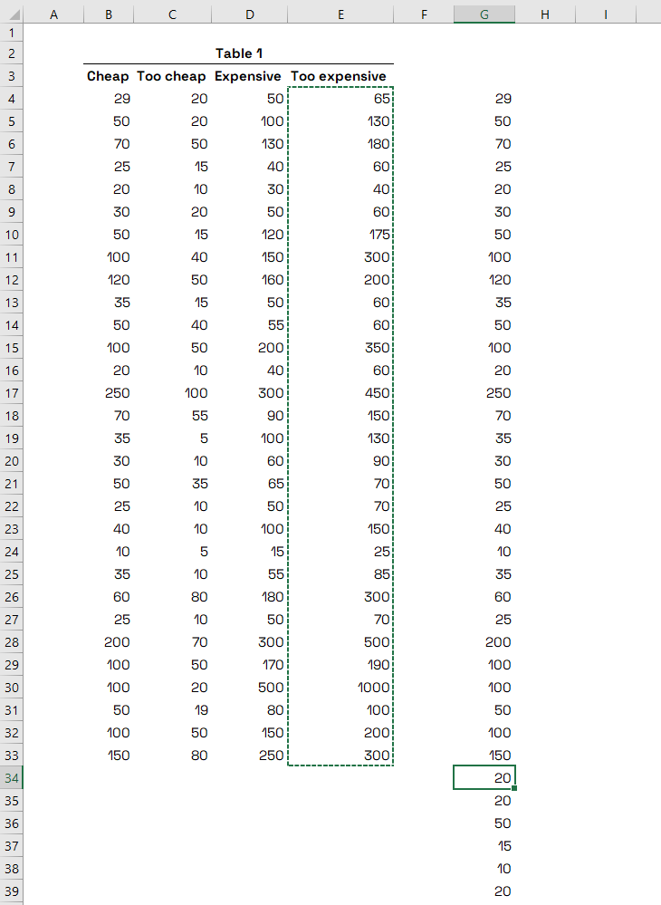
Van Westendorp - Copy all monetary values into a single column
Step 3 - Remove duplicates and sort monetary values
Select all cells in this new column and remove duplicates (you can find it in the "Data" tab in the Excel menu). In my case (120 values), I was left with 33 unique values. Again, select all the remaining values in the new column, right-click on the selection and sort them from the smallest to the largest number. You can name the new column "Value", and then your sheet should look like this:
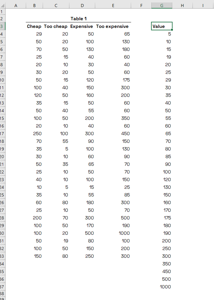
Van Westendorp - Remove duplicates of monetary values and sort the numbers
Step 4 - Calculate the frequency of each value in the dataset
Name four columns next to the "Value" column the same way as your original data set - Cheap, Too cheap, Expensive and Too expensive. Now, you will calculate how many times each of the values occur in columns.
You can do it using the Excel FREQUENCY formula. Start typing "=frequency", then select the first Cheap column for "data_array", type comma and then select the values in the "Value" column as "bins_array". Excel will autofill all frequency values in the "Value" column. In my case, the formula looked like this (for the first “Cheap” column):
=FREQUENCY(B4:B33,G4:G37)
Do it with the remaining three columns in your new set of columns. Your sheet should now look like this:
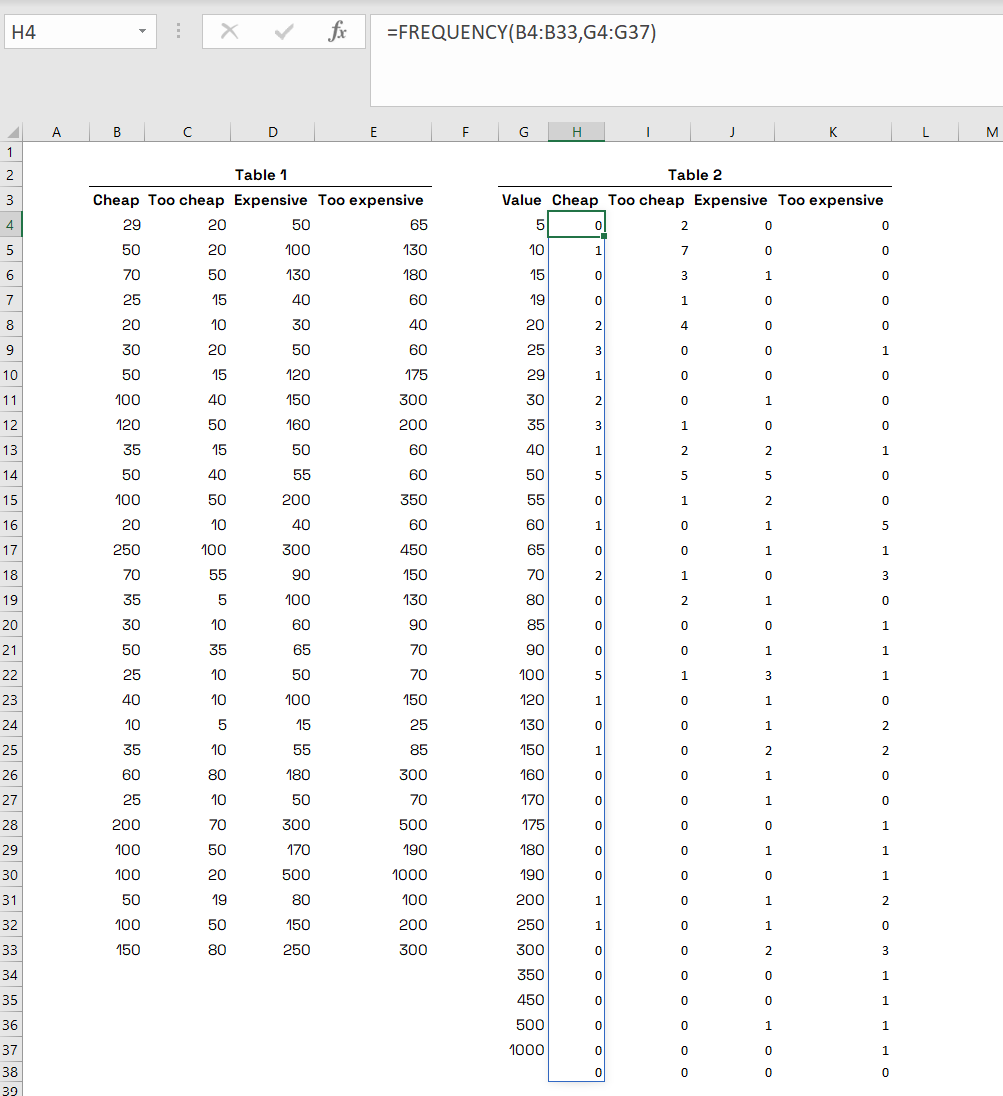
Van Westendorp - Calculate the frequency of monetary values in each of the dataset´s columns in Table 2
Step 5 - Calculate the percentages of Cheap and Too cheap
In this step, you will calculate how many respondents think that the given monetary value (and everything below or above it) is considered Cheap, Too cheap, Expensive or Too expensive. Copy the “Value” column and names of the remaining 4 columns into a new Table 3 next to the Table 2.
You will use this final part for the actual graph, so when preparing it, change the data type in the "Value" column from number to currency.
Then, use the SUM function to sum all frequency values in the first Cheap column and divide it by the SUM of these values (the same as number of your responses) so you will get number “1” in the first cell. In my case, the formula is as follows:
=SUM(H4:H37)/30
Set the cell data type from number to percentage, and you will get "100%" and copy the formula into the remaining rows in the column. After doing it, your first column should look like this:

Van Westendorp - Calculate the percentages of respondents for Cheap and Too cheap in Table 3
The copied formula takes into account only monetary values from its row down. The percentages in this column represent the % of respondents that think the given value and everything above it are Cheap.
Do the same with the Too cheap column.
Step 5 - Calculate the percentages of Expensive and Too expensive
For the remaining two columns, you will do the same, but you will adjust the formula a little by subtracting the previous formula from number 1 as shown in my formula below:
=1-(SUM(J4:J37)/30)
After doing that, your table should look like this:

Van Westendorp - Calculate the percentages for Expensive and Too Expensive columns
Step 6 - Creating the Van Westendorp graph
Select the entire Table 3 and go to Insert > 2-D Line chart (select the first graph option).
Adjust it by right-clicking on the graph and go to Select data. When the Select Data Source window pops up, deselect the "Value" field on the left side "Legend Entries (Series)" and hit the "Edit" button under Horizontal (Category) Axis Labels. When prompted, select the entire "Value" column (including the column name):

Van Westendorp - Chart adjustment in Excel
Confirm the set-up by hitting "OK" and there you have it - now your graph should look like this:
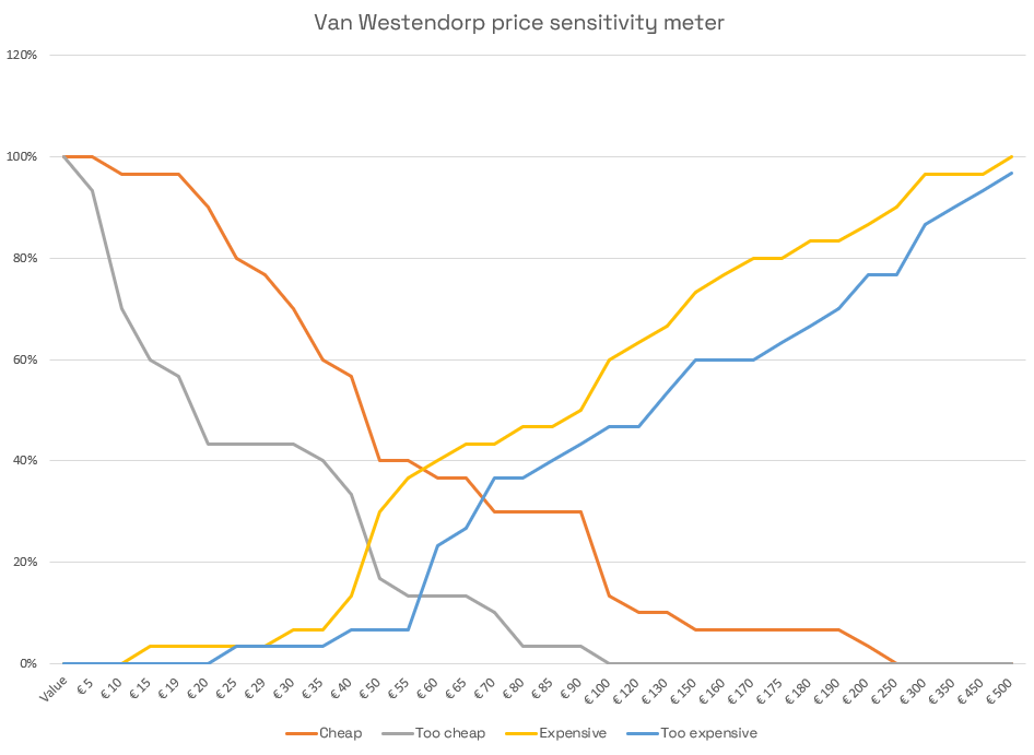
Van Westendorp - the final Excel graph
How to read Van Westendorp graph
The X-axis shows all monetary values, whereas the Y-axis shows the percentage of respondents thinking that the value and everything below it are Too cheap (or another characteristic depending on which line are you looking at).
The left-most intersection (Too cheap and Expensive lines) is the lower bound of the acceptable price range; on the other hand, the intersection of Cheap and Too expensive defines the upper bound of the range.
The bottom intersection of Too cheap and Too expensive defines an optimal price point (the same % of respondents thinking of the price as either Too expensive or Too cheap), whereas the upper one states the indifference price point.
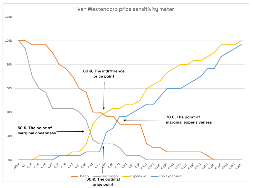
Van Westendorp - How to read the graph
And you are done! Congratulations on your Van Westendorp graph. Now you can present this magnificent piece of a chart to your boss and gain an honourable smart cookie status for a week.
P.S.: Watch out for the results - they can be helpful, but sometimes the price levels stated by respondents do not reflect their real-life consumer behaviour. Make sure you will conduct more pricing tests before launching!
Stay updated on similar articles - follow the maykin on LinkedIn or Facebook for more.